 |
| Celerie Kemble Photo: Claiborne Swanson Frank, in American Beauty |
"...I'm just custom mixing someone's space so it will be part of their identity." - Celerie Kemble (Elle Decor)
Continuing my interview with Celerie Kemble and the team at Schumcher from yesterday's post,
I begin by asking Celerie how the new wallcoverings play a part in the story of the already successful collaboration with Schumacher, in her fabric collection.
CK: Having the experience of working with Schumacher on the fabrics gave me faith that the execution of my designs, even if the concept was a stretch technically or creatively, would be flawless. So, that certainty was really freeing - it let me think that too big was o.k. and
the the crazy colors I was craving would be given a chance in the marketplace, even if they weren't going to be sure things...."
A few of the papers and fabrics do coordinate well and few are entirely new and are meant to stand in their own.
I never once held the fabrics next to the papers as we were designing ...but there is a cohesion in the two collections.
"I am drawn to certain patterns, colors, textures and their influence is reflected in my designs so there is only unconscious coordination {between the two}."
CK: I really think about where each pattern is likely to be used and I tried to create a pallet that would reflect well in those circumstances.
For instance - Hot House, which was a brazen mix of colors in the fabric story..
 |
| Hot House: Fabric Collection & new Wallcovering Collection |
The scale and the pattern drive the statement so I dialed color out to keep the impact focused on those elements.
 |
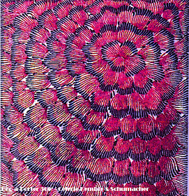
| Feather Bloom |
In another case, say Feather Bloom ..
I felt it was o.k. to use super deep colors because it would be very exciting to see in moody, jewel box rooms:
Libraries, Dining Rooms and Powder Rooms.
We scaled it so it would also look right on a ceiling.
The Stylized floral motifs in 'Feather Bloom' wallcoverings are comprised of radiating circular flower petals and the over-scaled hand print have a hand-painted quality, which is softened by its textured sisal ground.The palette includes nature-derived tones of jade green and China blue as well as chic art deco-inspired shades of plum and silver grey and can be seen here.
 |
| Celerie's mood board: Feather Bloom |
DAP: When you imagined them within your own design work, do you feel that it is a natural continuation of the process to then incorporate them within your Interior Design projects? Because of their adaptability can you reuse them in different ways and still feel that you are presenting unique schemes that are fresh?
CK: Absolutely - I feel my collection is like a troop of Circe du Soleil acrobats- with different music and in costumes of different colors they can take on varying rolls.
For example, my Flame pattern in the "Waltz" colorway tells a classic and elegant story, perfect for an entry hall, dining room, or study...
 |
| Flame - Waltz; Celerie Kemble designs; mood board for Flame |
while the blue and berry tones of the "Cha-Cha" color way is much more of a fashion play.
I can see it in a super chic library on the ceiling or int the interior cabinets of a dark lacquered bookcase.
 |
| Celerie Kemble designs; Flame: Cha-Cha |
DAP: How do your clients react, when you present your collections to them as part of the design scheme?
CK: I'm usually very careful with my clients homes because I don't want them to feel any conflict of interest or pressured to use my products for fear of hurting my feelings...but in some cases these papers were being developed in a timeline alongside a clients design scheme and inevitably the colors and scale matched into the project at hand because they would all become married in my head.
Six months later as we were trying to pick a Powder Room paper my client laughed at the clouds pattern being exactly the scale, vibe, and color pallet her powder room needed. In that case It was a bit more confluence than kismet.
Can't get enough of Celerie and her fabulous taste - try some of the great books!
Six months later as we were trying to pick a Powder Room paper my client laughed at the clouds pattern being exactly the scale, vibe, and color pallet her powder room needed. In that case It was a bit more confluence than kismet.
 |
| Cirrus Clouds - Shanghai |
"It's all about the client, not about you. Be prepared to make beds and put away your clients' dishes. You're the interface between reality and aspiration, and your job is to make people feel good about themselves and their rooms." - Celerie Kemble via Elle Decor
Can't get enough of Celerie and her fabulous taste - try some of the great books!
I just wanted to send a huge thank you to the entire team of Schumacher, and Celerie Kemble for taking the time to share their thoughts and musings on this fabulous new collection.
Please, leave a comment on what your favorite patterns and color ways are, and how you plan on using them in your design schemes! Can't wait to hear all about it...


No comments:
Post a Comment
@Dec-a-Porter we love to hear from you ...Please share your comments.